case - ViroGates | suPARnostic
ViroGates - a modern medtech company with revolutionary inventions
Design – Identity – Development
Decoupling WordPress from the frontend
When Virogates came to us, they were using an old install of WordPress with years of content. Obviously the content was important to be preserved, and they asked us for our opinion in how to achieve a fast website, while maintaining all existing data.
After talks about migrating to another CMS (like our favourite option strapi) we ended on keeping the WordPress install - which we cleaned from almost all plugins and unnecessary bloat. We then switched to using WordPress only as an API - and created a next.js app for the frontend. This resulted in a much faster visitor experience.

The suPAR biomarker
The suPAR biomarker can predict critical illness across diseases by measuring the level of activation in the immune response.
Visit virogates.com
Creating a new identity
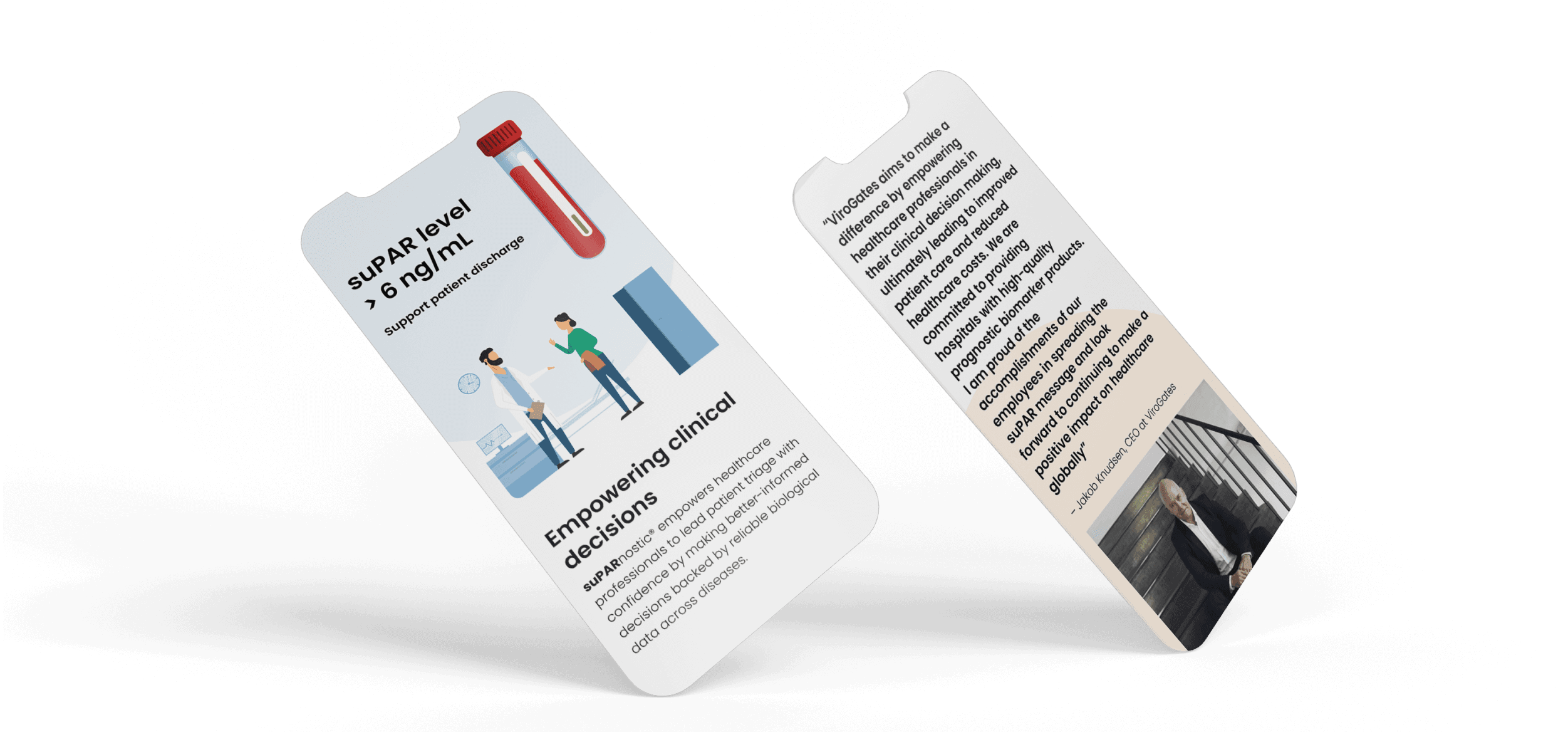
We wanted to create an identity for ViroGates which would be perceived as fresh and bold, but still with the authority required by a medtech company. The result was pastel colors, with a touch of clean lines and simple illustrations
Hard egdes and soft organic figures
Sometimes big organizations needs some hard edges to provide valid and trustworthy information but most importantly talking to its users in a soft and human language. We made ViroGates best of both worlds. The organic blobs is a part of making Virogates unique.
The not so good result
Dangerous
The red background and the full test tube, makes it clear that this is not a good result for the patient
The better result
We needed to convey the message of suPAR
Utilizing a test tube and a soft green background - it's easy to tell this is a good result
Visual props
Small motion elements, underlining the use case
Visuals – Styleguide
Creating a unique style - while maintaining a professional look

Client feedback
"We were extremely happy with the result, as it gave our brand and website a modern look that we are proud to present to our partners."
- David Stig Wülser, Digital Marketing Manager @ ViroGates